Back to Portfolio
Case Study

UI/UX Internship · Nnine Solution

From rough concepts to production-ready interfaces

UI/UX Internship Case Study · January–April 2025

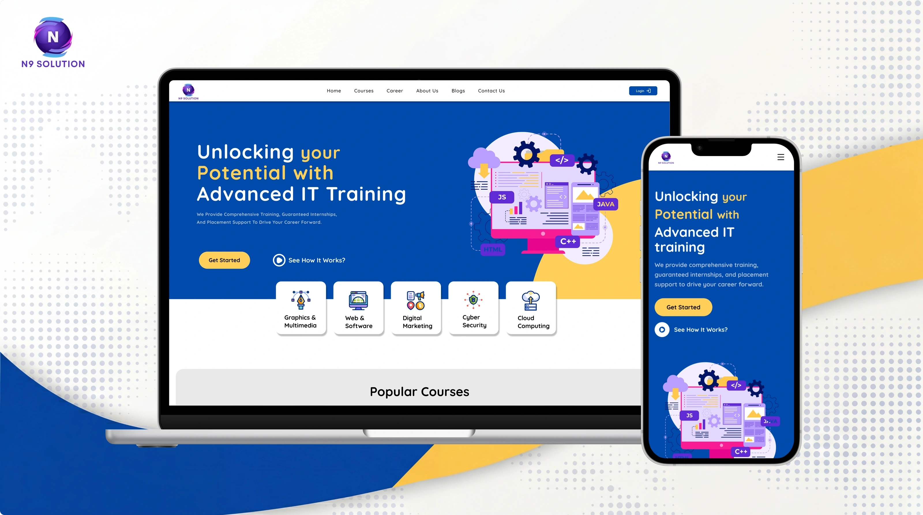
Nnine Solution internship — case study cover
Role
UI/UX Design Intern
Company
Nnine Solution Pvt. Ltd.
Duration
3 months
Team
Design + Development
Primary Tools
Figma, Miro, Relume.io

Overview

During my three-month internship at Nnine Solution, I worked as a UI/UX Design Intern within the Web Design Department.

My work covered several real-world web projects, including:

  • Training center website redesign
  • College website static-page design
  • Education consultancy responsive website

Across these projects, I worked through different parts of the UI/UX process: research and visual exploration, information architecture, wireframing, high-fidelity design, prototyping, design systems, micro-interactions, usability checks, feedback, and developer handoff.

“My biggest learning was moving from designing individual screens to thinking about complete user flows and reusable systems.”
The Design Challenge

When I joined the internship, the design workflow was relatively informal. Previous work could move directly from an idea to high-fidelity screens, which made consistency and iteration harder.

There was also no shared design system or structured wireframing stage.

My internship objectives therefore became:

  • Introduce a more structured UI/UX workflow.
  • Explore layouts before committing to high-fidelity visuals.
  • Create reusable Figma components and styles.
  • Improve consistency across screens and projects.
  • Prototype interactions before development.
  • Collaborate more closely with developers during handoff.

Because the internship lasted only three months, extensive user research and large-scale usability testing were outside the practical scope. Early decisions often relied on secondary research, design references, mentor feedback, and quick peer testing.

Project 01 · Training Center Website Redesign

Project Overview

The training center website was my main individual project during the internship.

The goal was to refresh the experience across the landing page, course/cart section, online course pages, and payment flow, while making the interface more cohesive and easier to navigate.

My responsibilities covered the design process from initial exploration through prototype and handoff.

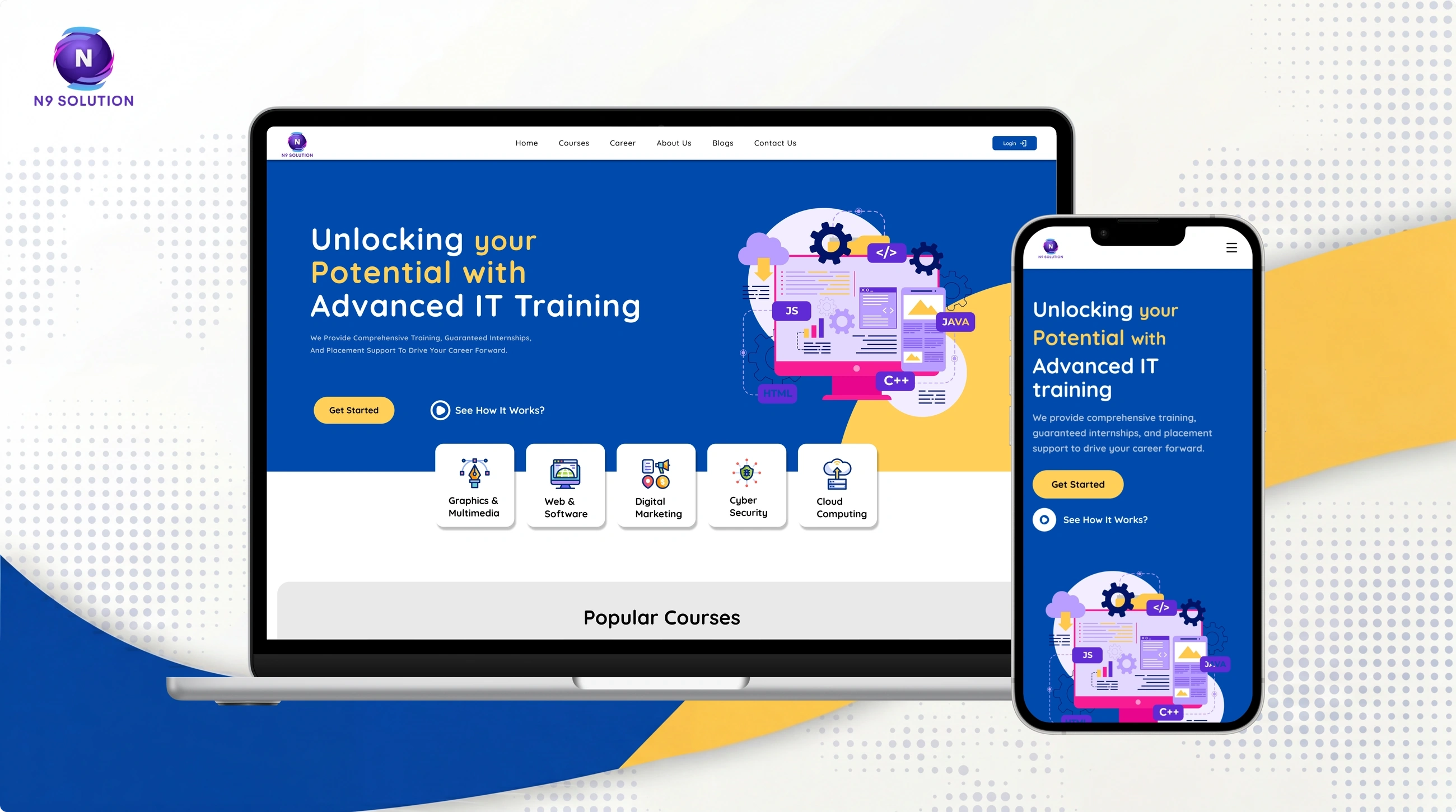
Training centre landing page shown on a laptop and a phone
The redesigned training centre landing page, desktop and mobile

My contribution

  • Landing page redesign
  • Course/cart redesign
  • Course detail and online course pages
  • Payment page
  • Visual hierarchy improvements
  • CTA refinement
  • Micro-interactions
  • Design system components
  • Interactive prototyping
  • Developer handoff

Understanding the Existing Experience

I started by reviewing the existing website, brand assets, and common patterns used by similar education and training platforms.

I also explored references on platforms such as Behance, Dribbble, and Wix to understand current patterns for:

  • Course discovery
  • Course cards
  • Landing-page sections
  • Calls to action
  • Checkout/payment flows
  • Educational content presentation

The goal was not to copy existing patterns, but to identify familiar interaction models that could be adapted to the project.

From Wireframes to High-Fidelity UI

Instead of immediately designing polished screens, I first explored the structure using low-fidelity wireframes.

Process

  1. Requirements
  2. Sitemap / Flow
  3. Low-Fidelity Wireframe
  4. High-Fidelity UI
  5. Prototype
  6. Feedback
  7. Refinement
  8. Handoff

Relume.io helped me quickly explore page structures, while Figma was used for the detailed interface and interactive prototype.

Early walkthroughs helped identify layout and navigation issues before visual polish was added.

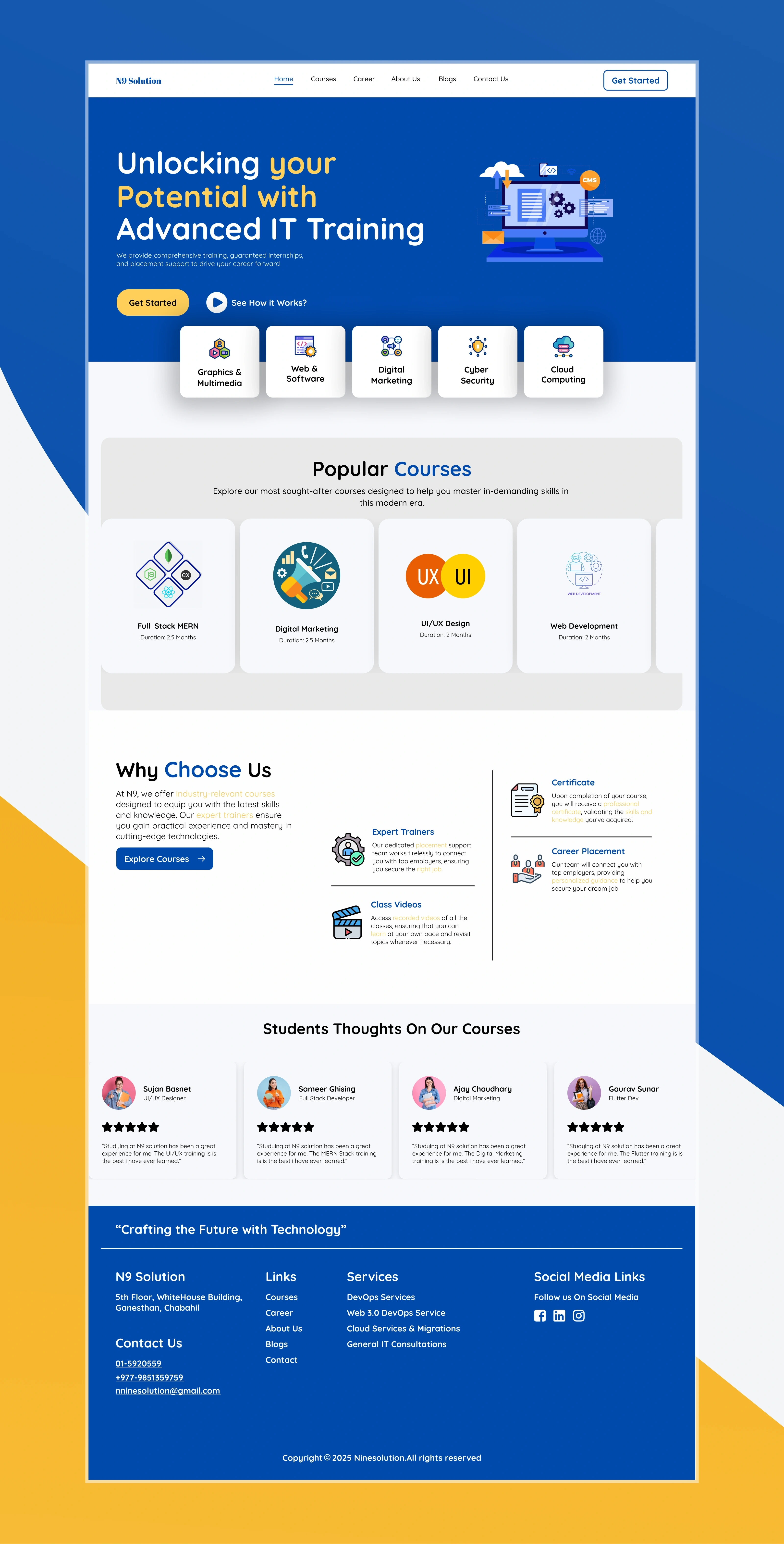
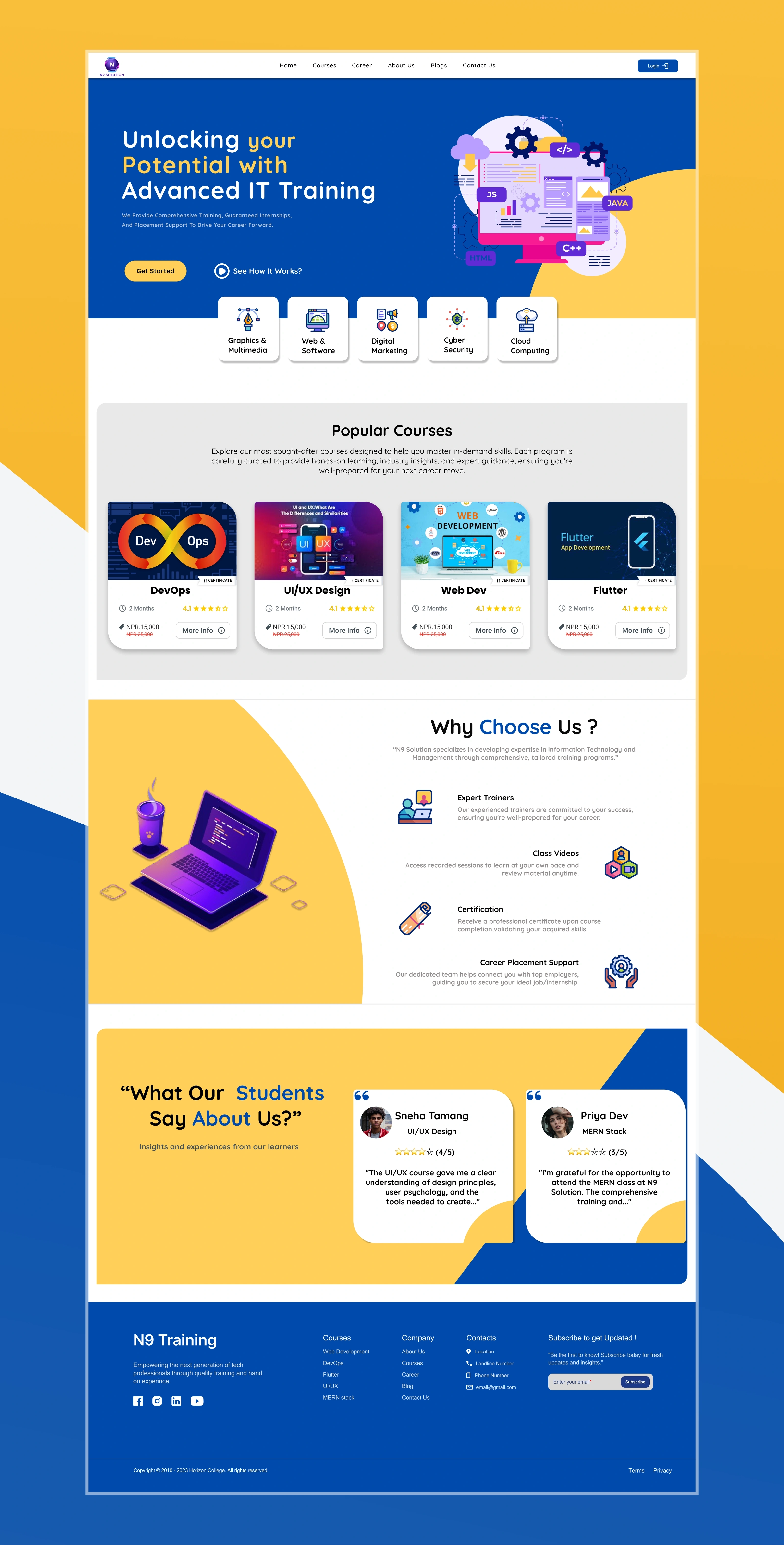
Full training centre landing page layout with popular courses, reasons to choose and testimonials
Landing page · full layout
Alternative full landing page layout for the training centre
Landing page · alternate layout

Improving the Course Experience

One of the main areas I worked on was the course/cart experience.

The redesigned course presentation focused on making important information easier to scan, including:

  • Course overview
  • Instructor information
  • Syllabus
  • Student reviews
  • Pricing
  • Primary CTA

The goal was to reduce visual clutter and create a clearer path from discovering a course → understanding it → taking action.

I also refined CTA placement and layout hierarchy based on mentor feedback and design reviews.

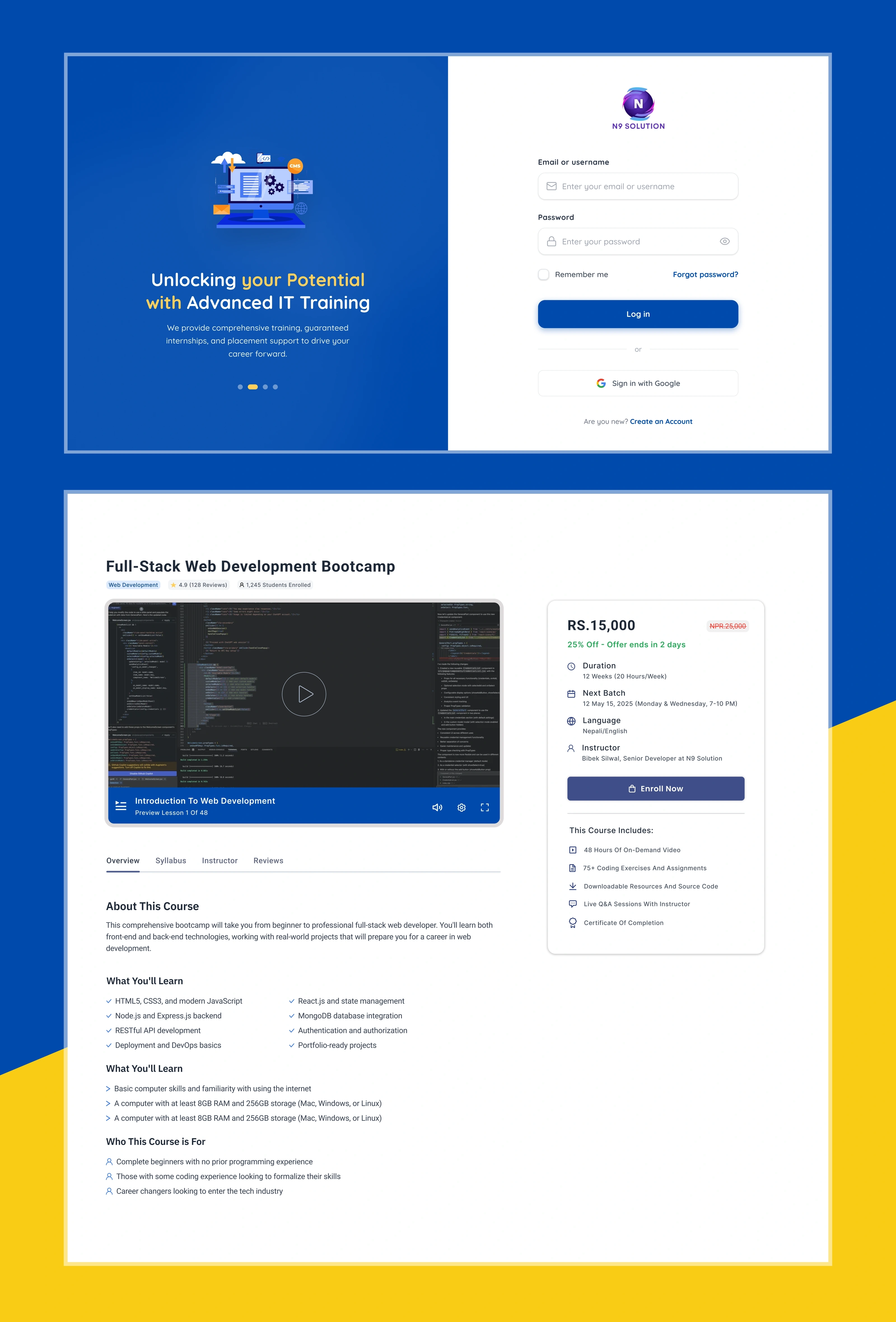
Login screen and the course detail page on its overview tab
Login, and the course detail page on its overview tab
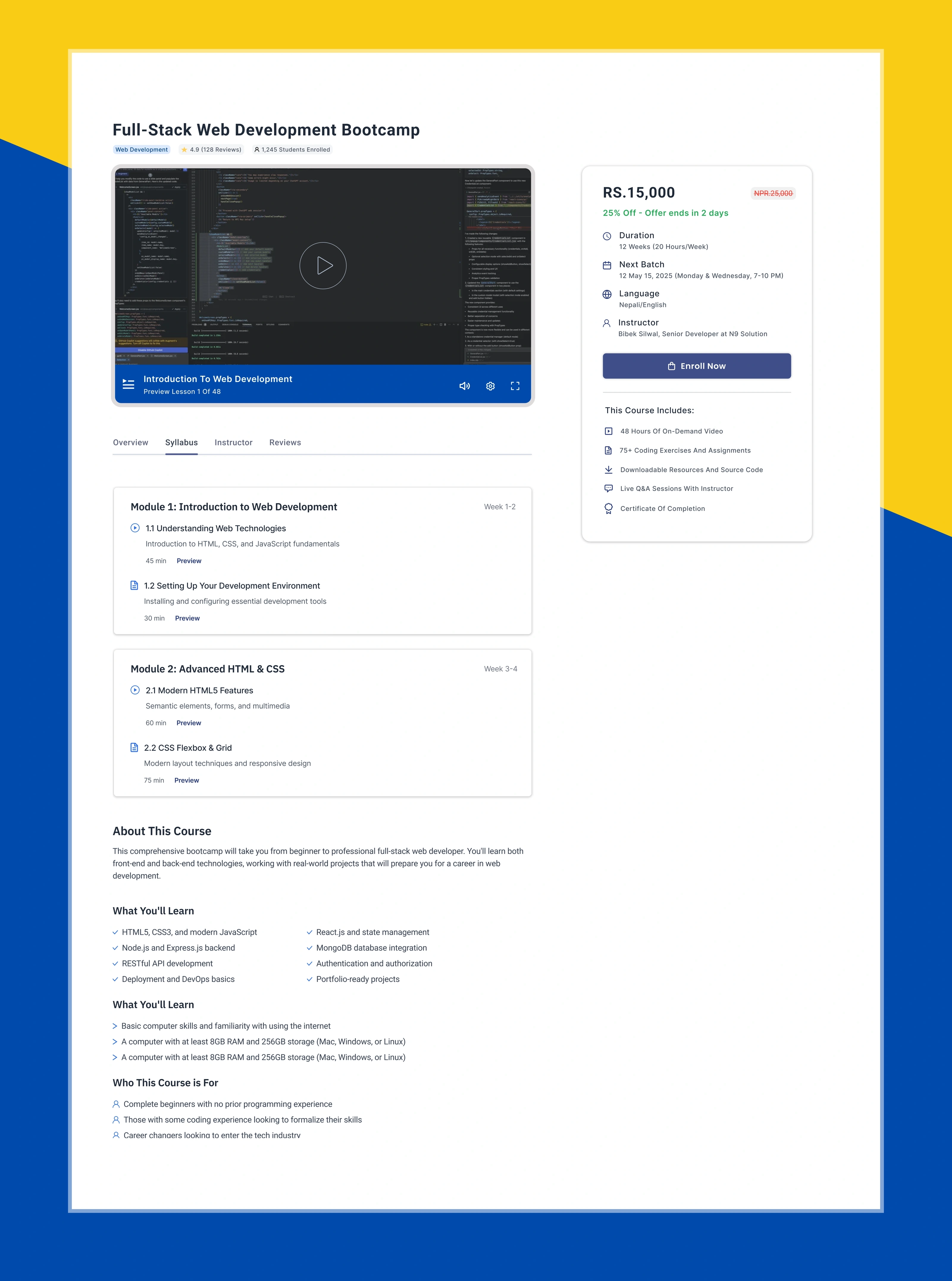
Course detail page showing the syllabus tab with expandable modules
Syllabus tab
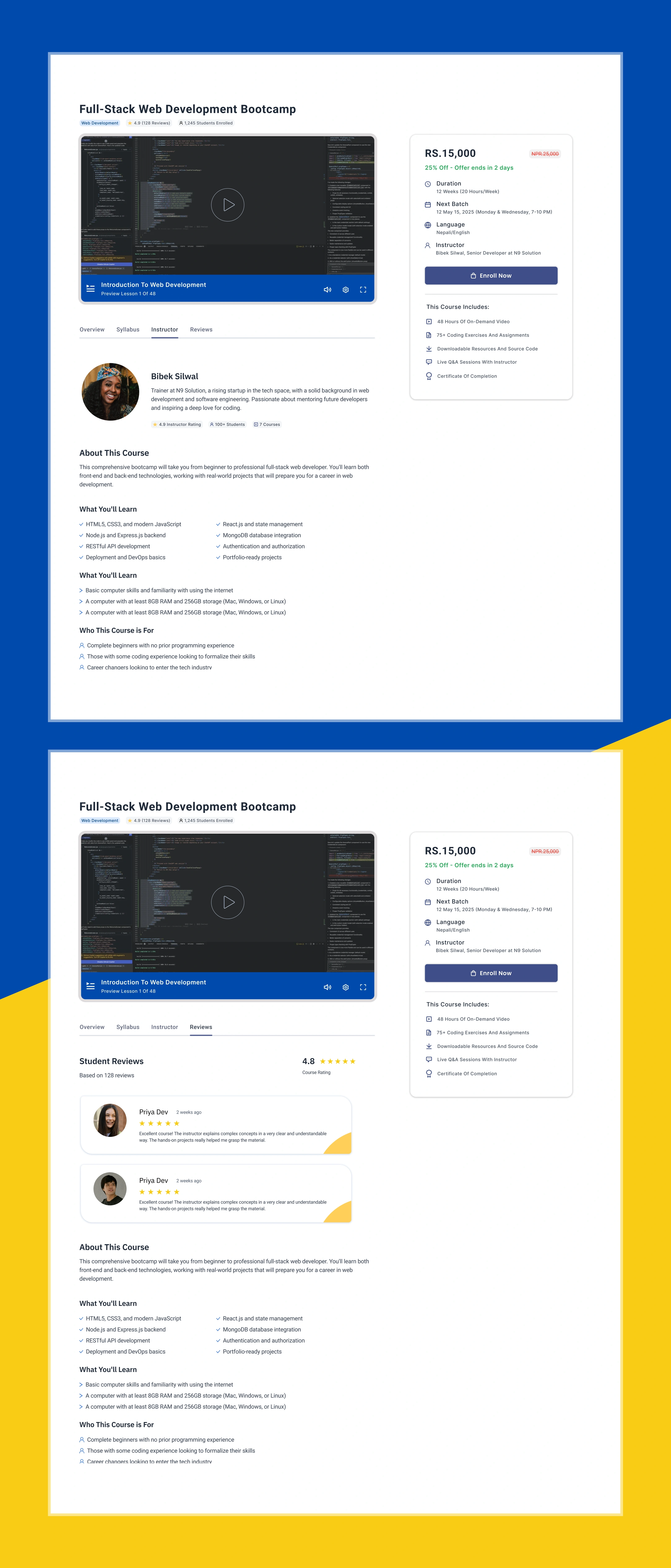
Course detail page showing the instructor tab and the student reviews tab
Instructor and reviews tabs

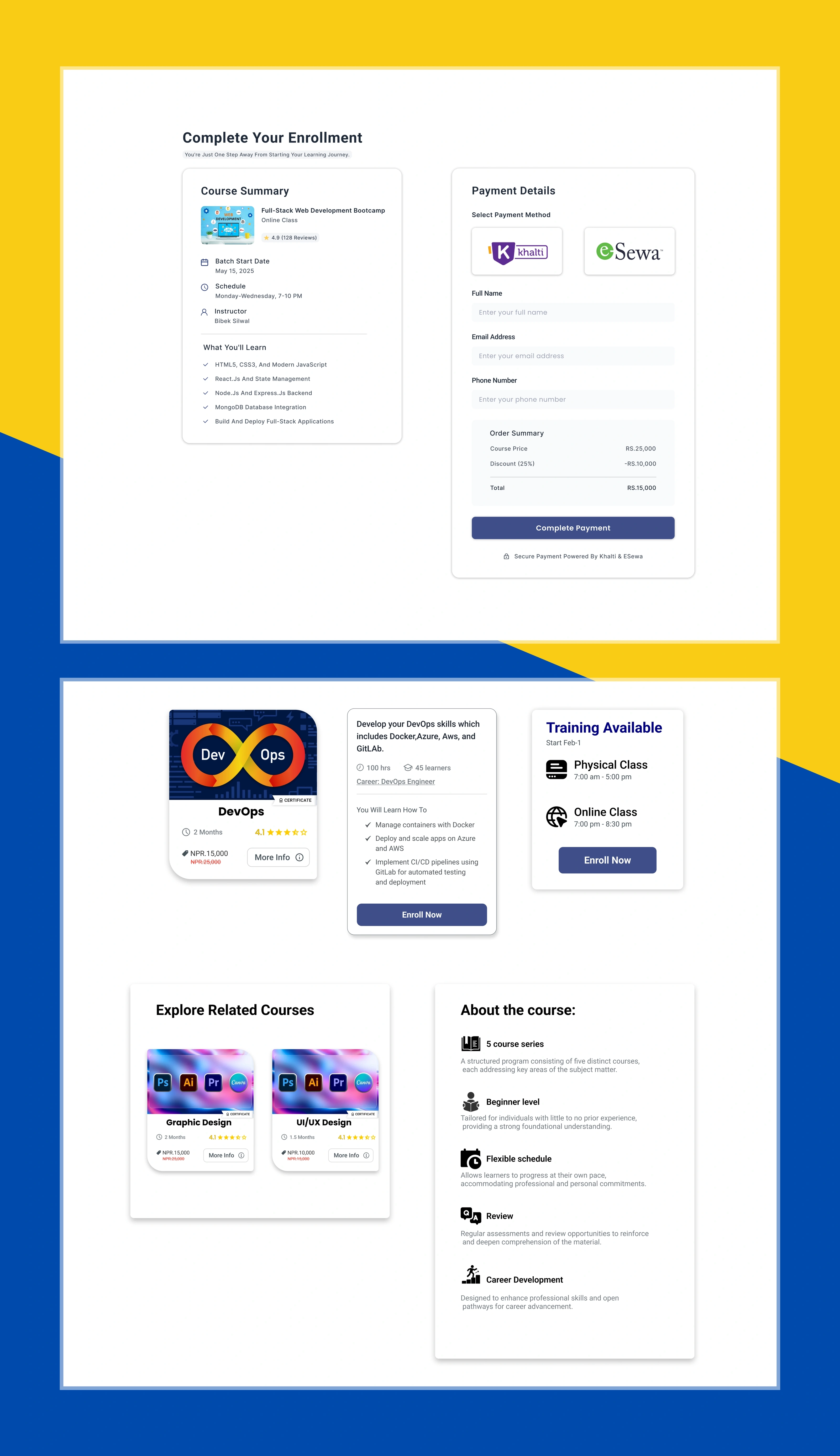
Simplifying the Payment Flow

The payment page was designed as a focused part of the journey rather than another information-heavy page.

I used clearer hierarchy and progress feedback to help users understand where they were in the checkout process.

A simplified mental model guided the flow:

  1. Course
  2. Cart
  3. Payment
  4. Confirmation

I also explored progress indicators and interaction states so the prototype communicated what happens after each action.

Enrollment and payment page, plus course cards and a related-courses panel
Enrollment and payment page, with the course card and related-course panels

Micro-Interactions

After the core interface was reviewed, I was asked to add micro-interactions to the online course section.

I explored interaction references and then designed lightweight animations in Figma.

Examples included:

  • Course-card hover states
  • CTA interactions
  • Icon transitions
  • Landing-page motion
  • Checkout progress feedback

The intention was not to add animation for decoration. Each interaction was used to provide feedback or make the interface feel more responsive.

The final animations were prepared for developer integration and reviewed before handoff.

Project 02 · College Website Static Pages

My Contribution

For the college website, I worked as part of a two-person design team.

My responsibility was focused on the Notice and Blog sections.

  • Notice page

    I designed a Latest Notice area with an annual calendar feature so users could quickly identify and access important academic notices.

  • Blog page

    I designed a blog overview that prioritized featured content, article discovery, clear content hierarchy, and consistent card patterns.

We used the shared Figma component library to maintain visual consistency across the website.

My role

  1. Information structure
  2. Page layout
  3. High-fidelity UI
  4. Prototype
  5. Feedback
  6. Refinement

Project 03 · Education Consultancy Website

My Contribution

The education consultancy website was another two-person project.

The team worked together on the overall sitemap, wireframes, high-fidelity designs, and design system.

My personal responsibility was designing these pages:

  • Introduction
  • Gallery
  • Documentation Process
  • Study Abroad / USA
  • Blog Overview
  • Contact

Each page was designed for both desktop and mobile.

Designing Responsively

For the consultancy website, I had to think beyond the desktop layout.

I adapted the same content hierarchy across different screen sizes by considering:

  • Navigation behavior
  • Content stacking
  • Typography scale
  • Image proportions
  • Button placement
  • Footer structure
  • Touch-friendly spacing

The goal was to preserve the hierarchy of the desktop design rather than simply shrinking it for mobile.

Building a Reusable Design System

One of the most important contributions I made during the internship was establishing a shared Figma library.

The system included:

  • Color styles
  • Typography
  • Icons
  • Buttons
  • Cards
  • Form fields
  • Reusable components
  • Interaction states

Instead of manually updating every screen, components allowed changes to propagate across designs.

For example, updating a button's hover state could update every instance using that component.

This made the work more consistent and reduced repetitive design work.

Feedback & Usability Checks

Design reviews were an important part of my workflow.

I regularly submitted designs to my mentor and teammates for feedback.

Typical feedback included:

  • Spacing adjustments
  • Typography choices
  • CTA placement
  • Layout rhythm
  • Navigation clarity
  • Mobile behavior

I also ran quick peer usability checks on prototypes by asking users to complete simple tasks such as clicking CTAs and navigating between pages.

Their feedback helped me refine labels, button placement, and menu flow.

This was lightweight testing rather than formal research, but it helped catch obvious usability problems before handoff.

Developer Handoff

The internship also taught me that good UI design does not end with a Figma file.

For handoff, I prepared:

  • Annotated Figma frames
  • Sizing information
  • Assets
  • Interaction details
  • Component states

I also met with front-end developers to explain interactions and resolve implementation questions.

  1. Design
  2. Development
  3. Review

This feedback loop helped maintain visual and interaction fidelity.

My Design Workflow

Across the internship, my workflow gradually became more structured:

  1. Understand the requirement
  2. Research & reference exploration
  3. Information architecture
  4. Low-fidelity wireframes
  5. High-fidelity UI
  6. Design system / components
  7. Interactive prototype
  8. Mentor & peer feedback
  9. Usability checks
  10. Refinement
  11. Developer handoff

This was one of the biggest changes in my approach during the internship.

I stopped treating a UI screen as the final output and started treating it as one stage in a larger product-design process.

Tools

Figma
UI design, prototyping, components, design system
Miro
User journeys, flowcharts, brainstorming
Relume.io
Low-fidelity page structures and sitemaps
Behance / Dribbble / Wix
Visual and interaction references
Freepik / Flaticon / Unsplash
Supporting imagery and icon assets

Outcome

By the end of the internship, I had contributed to multiple real-world web projects and worked across different levels of the design process.

  • Training Center

    • Redesigned landing page
    • Improved course/cart experience
    • Designed payment flow
    • Created interactive prototypes
    • Added micro-interactions
  • College Website

    • Designed notice section
    • Designed annual calendar feature
    • Designed blog overview
  • Education Consultancy

    • Designed six key pages
    • Created desktop and mobile layouts
    • Contributed to sitemap, wireframes, and design system
  • Process contribution

    • Established reusable Figma components
    • Introduced structured wireframing and prototyping
    • Participated in peer workshops around the design process
    • Prepared designs and assets for developer handoff

What I Learned

  • Start with structure, not decoration

    Wireframing helped me identify problems in layout and navigation before spending time on visual details.

  • Components scale better than individual screens

    A reusable component library made consistency easier and reduced repetitive work.

  • Feedback is part of the design process

    Mentor and developer feedback often exposed issues that were difficult to notice when working alone.

  • Responsive design requires hierarchy

    A mobile design is not simply a smaller desktop design. Content priority and interaction patterns need to be reconsidered.

  • Motion needs a purpose

    Micro-interactions are most useful when they communicate feedback, state, or progression rather than simply adding visual movement.

  • Handoff is a design responsibility

    A good design must be understandable to the person implementing it. Clear specifications and communication are part of the UX process.

Challenges & Constraints

The internship had several practical constraints.

  • Limited time

    A three-month internship limited the amount of research, testing, and iteration possible.

  • Limited research data

    Most early decisions relied on secondary research, design references, mentor feedback, and peer testing rather than broad user interviews.

  • Working within existing requirements

    As an intern, I was often improving an existing product or working within requirements defined by the team. This meant balancing my design ideas with project constraints and feedback.

  • Collaboration

    Working with developers and other designers taught me to communicate decisions clearly instead of treating the Figma file as the only source of truth.

Final Takeaway

My internship at Nnine Solution was the point where UI/UX moved from something I was learning academically to something I was practicing in a professional environment.

I worked on real website projects, contributed to both individual and team-based work, created reusable components, designed responsive interfaces, prototyped interactions, tested flows, received professional feedback, and collaborated with developers.

The most important change was in how I approached design:

I learned to design systems and user flows, not just screens.

The internship gave me practical experience in taking a requirement, exploring the problem, structuring the experience, designing the interface, validating it through feedback, and preparing it for implementation.

Nnine Solution closing frame

Internship Snapshot

Role
UI/UX Design Intern
Company
Nnine Solution Pvt. Ltd.
Duration
17 Jan 2025 – 17 Apr 2025
Main Projects
Training Center, College Website, Education Consultancy
Primary Tool
Figma
Supporting Tools
Miro, Relume.io
Core Skills
Wireframing, UI Design, Prototyping, Design Systems, Responsive Design, Interaction Design, Handoff
Work Type
Individual + Team Projects